In this article, I am going to show you how to remove outliers from Seaborn boxplots. First, I am going to plot a boxplot without modifications. Then, I will remove all of the outliers. In the end, I am going to restore outliers, but this time I am going to make them less prominent.
Table of Contents
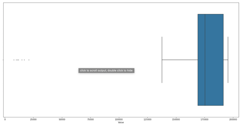
Boxplot with outliers
Let’s start with plotting the data I already have.
import seaborn as sb

sb.boxplot(x = 'Value', data = with_merged)
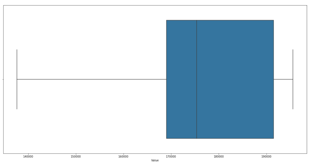
Boxplot without outliers
To remove the outliers from the chart, I have to specify the “showfliers” parameter and set it to false.
sb.boxplot(x = 'Value', data = with_merged, showfliers = False)
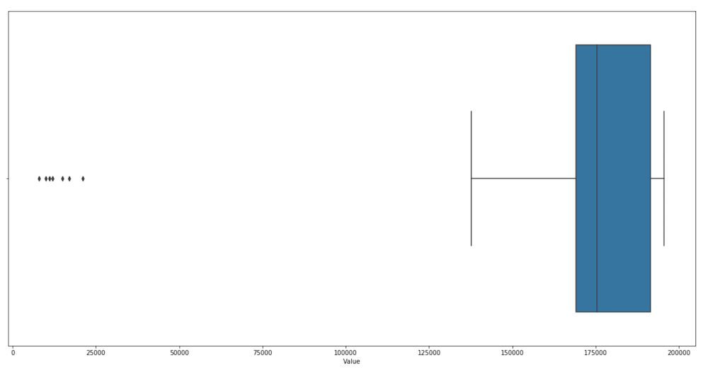
Change the outliers style
In the next example, I am going to change the size of the outliers markers to make them less distracting for people who look at the chart.
sb.boxplot(x = 'Value', data = with_merged, flierprops = dict(markerfacecolor = '0.50', markersize = 2))