The simplest method to check whether there is seasonality in time series data is to plot an autocorrelation graph and just look at it.
Table of Contents
Plotting is easy because Pandas has a built-in function which can do it for us. Just pass a single column of a Pandas dataframe as the argument:
from pandas.plotting import autocorrelation_plot
autocorrelation_plot(values_sorted_by_date)
How does it work?
Pandas calculates time lags between values and checks whether values from different dates are correlated. If yes, we may use data from the past to predict a future value. If, additionally the values change in cycles, we assume that some seasonality occurs in the time series.
What are we looking for?
Values near zero indicate that the data is “random” (in this case it means that there is no seasonality). The more the result differs from zero, the more likely some correlation exists.
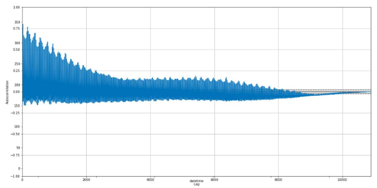
There is something we are more likely to see in reality than in an online tutorial. This chart indicates some correlation between time lags, but I think that there is no seasonality.

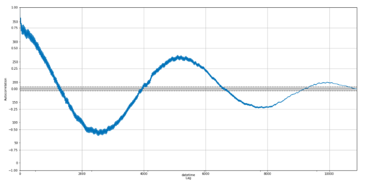
The thing we are looking for is a chart that resembles sine waves. Such a chart indicates that a value strongly correlates with another data point in the future, hence there is seasonality in the dataset.
Ideally, we would see something like this:


