“Parallel coordinates” is a type of a plot which is useful to visualize trends in multidimensional data. You can plot the variables and use multiple axis labels to visualize their values. If you have a categorical variable, you can also use colors to mark the observations assigned to a particular category.
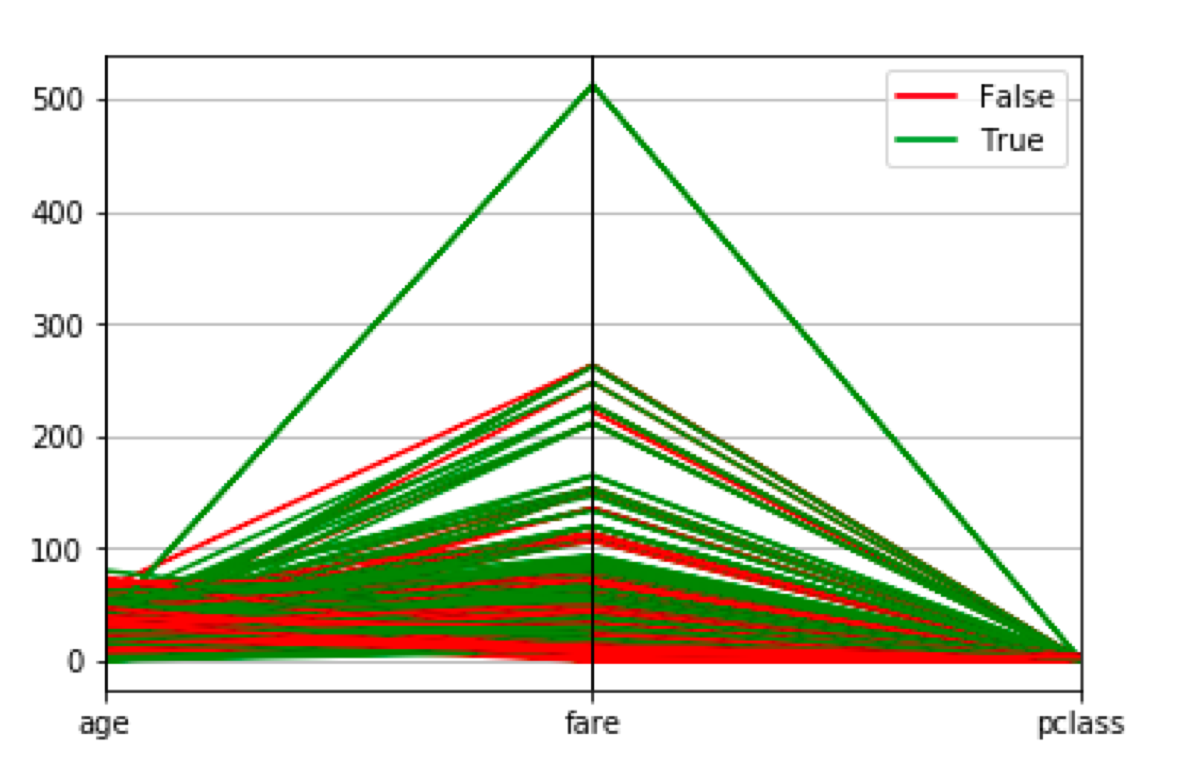
This time, I have to describe failure. I tried to plot a parallel coordinates plot using only “built-in” functions of matplotlib. The best I managed to do was this:
import seaborn as sns
data = sns.load_dataset('titanic')

from pandas.plotting import parallel_coordinates

cols = ['age', 'fare', 'pclass', 'alive']
selected_columns = data[cols]
selected_columns['is_alive'] = selected_columns['alive'] == 'yes'
selected_columns = selected_columns.drop(columns = 'alive')

parallel_coordinates(selected_columns, 'is_alive', colors = ['red', 'green'])

Note that it plots the same y-axis for all values so, most of them are unreadable.
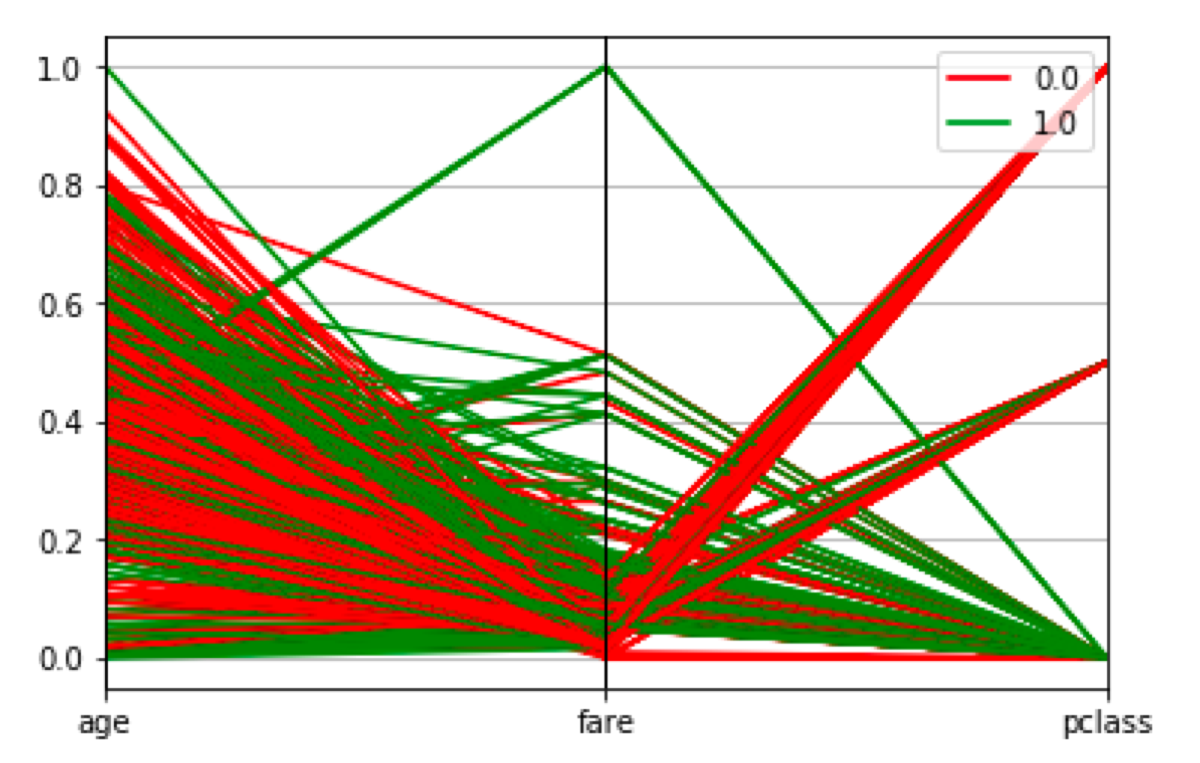
I can do a little bit better and scale the values.
from sklearn.preprocessing import MinMaxScaler
import pandas as pd

scaler = MinMaxScaler()

transformed = scaler.fit_transform(selected_columns)
transformed_pd = pd.DataFrame(transformed)
transformed_pd.columns= selected_columns.columns

parallel_coordinates(transformed_pd, 'is_alive', colors = ['red', 'green'])

In this case, the relation between data points can be easily spotted, but I don’t know the exact values anymore.
At some point, I found a GitHub issue related to setting separate y-axis for all columns. Apparently, it is not possible because of a workaround used to plot the parallel coordinates.

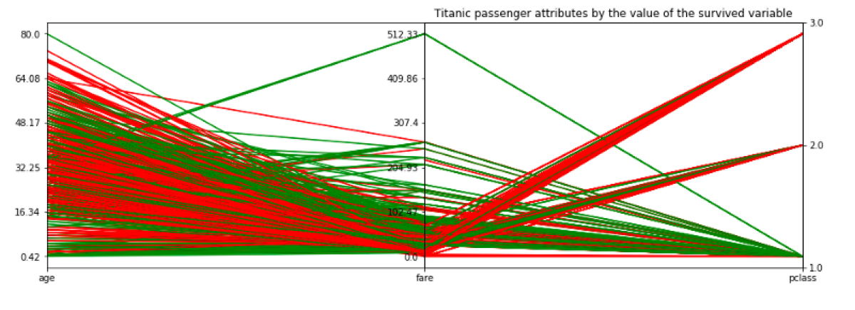
Fortunately, there is a great blog post about plotting parallel coordinates written by Ben Alex Keen. He created a plot which looks exactly like the output I wanted, but he had to do it “manually.” He specified every part of the plot, and the solution requires a lot of code.
When I adjusted his code to my example I ended up with this:
# I need two subplots because I want to plot 3 columns. I will use the left, middle and right axis to plot valuesfig, axes = plt.subplots(1, 2, sharey=False, figsize=(15,5))

# This line removes margin between subplots
plt.subplots_adjust(wspace=0)

colors = {
    'yes': "green",
    'no': "red"
}

cols = ['age', 'fare', 'pclass']
x = [i for i, _ in enumerate(cols)]

# I set a different number of ticks for every columns because one of them has only 3 distinct values
ticks = [6, 6, 3]

# This loop is used to scale values, but it also preserves the original ranges, so we can use them to plot labels.
min_max_range = {}
for col in cols:
    min_max_range[col] = [data[col].min(), data[col].max(), np.ptp(data[col])]
    data[col] = np.true_divide(data[col] - data[col].min(), np.ptp(data[col]))

for i, ax in enumerate(axes):
    for idx in data.index:
        is_alive = data.loc[idx, 'alive']
        ax.plot(x, data.loc[idx, cols], colors[is_alive])
    ax.set_xlim([x[i], x[i+1]])

# This function creates "fake" labels for normalized values. We want to make it look like we had separate labels for every column, but we will only replace the values on the y-axis
def set_ticks_for_axis(dim, ax, ticks):

    #That code generates labels for normalized values.
    min_val, max_val, val_range = min_max_range[cols[dim]]
    step = val_range / float(ticks-1)
    tick_labels = [round(min_val + step * i, 2) for i in range(ticks)]

    # The following lines generate the position of labels
    norm_min = data[cols[dim]].min()
    norm_range = np.ptp(data[cols[dim]])
    norm_step = norm_range / float(ticks-1)
    ticks = [round(norm_min + norm_step * i, 2) for i in range(ticks)]

    ax.yaxis.set_ticks(ticks)
    ax.set_yticklabels(tick_labels)

for dim, ax in enumerate(axes):
    ax.xaxis.set_major_locator(ticker.FixedLocator([dim]))
    set_ticks_for_axis(dim, ax, ticks=ticks[dim])
    ax.set_xticklabels([cols[dim]])

# The same modifications have to be done for the last axis
ax = plt.twinx(axes[-1])
dim = len(axes)
ax.xaxis.set_major_locator(ticker.FixedLocator([x[-2], x[-1]]))
set_ticks_for_axis(dim, ax, ticks=ticks[dim])
ax.set_xticklabels([cols[-2], cols[-1]])

plt.title("Titanic passenger attributes by the value of the survived variable")

plt.show()

If you know a shorter and less brittle way to do the same thing, let me know ;)
