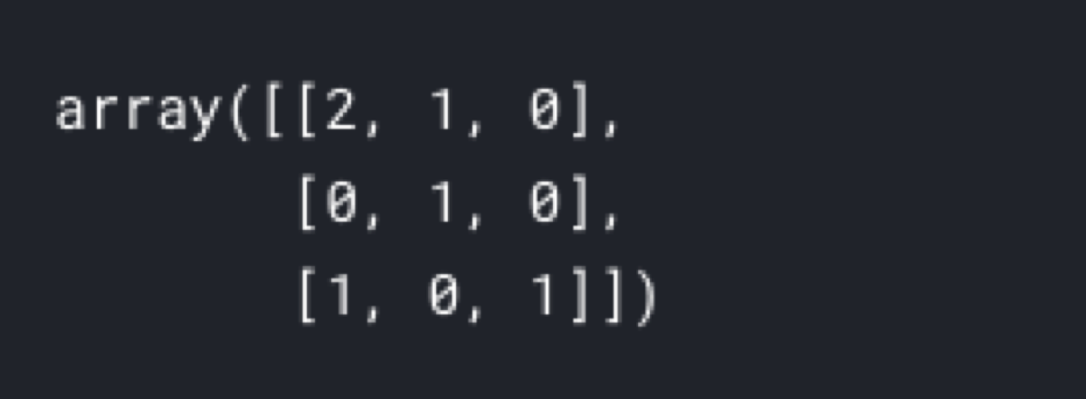
Do you wonder where the correct values are? What does a row mean? What is in the columns?
Let’s look at this confusion matrix:
from sklearn.metrics import confusion_matrix

y_true = ["road", "road", "traffic_sign", "pedestrian", "road", "pedestrian"]
y_pred = ["road", "traffic_sign", "traffic_sign", "road", "road", "pedestrian"]
labels = ["road", "traffic_sign", "pedestrian"]

confusion_matrix(y_true, y_pred, labels = labels)

It is not helpful. It is just an array. Still, no indication where the correct predictions are. It does not even tell the order of labels.
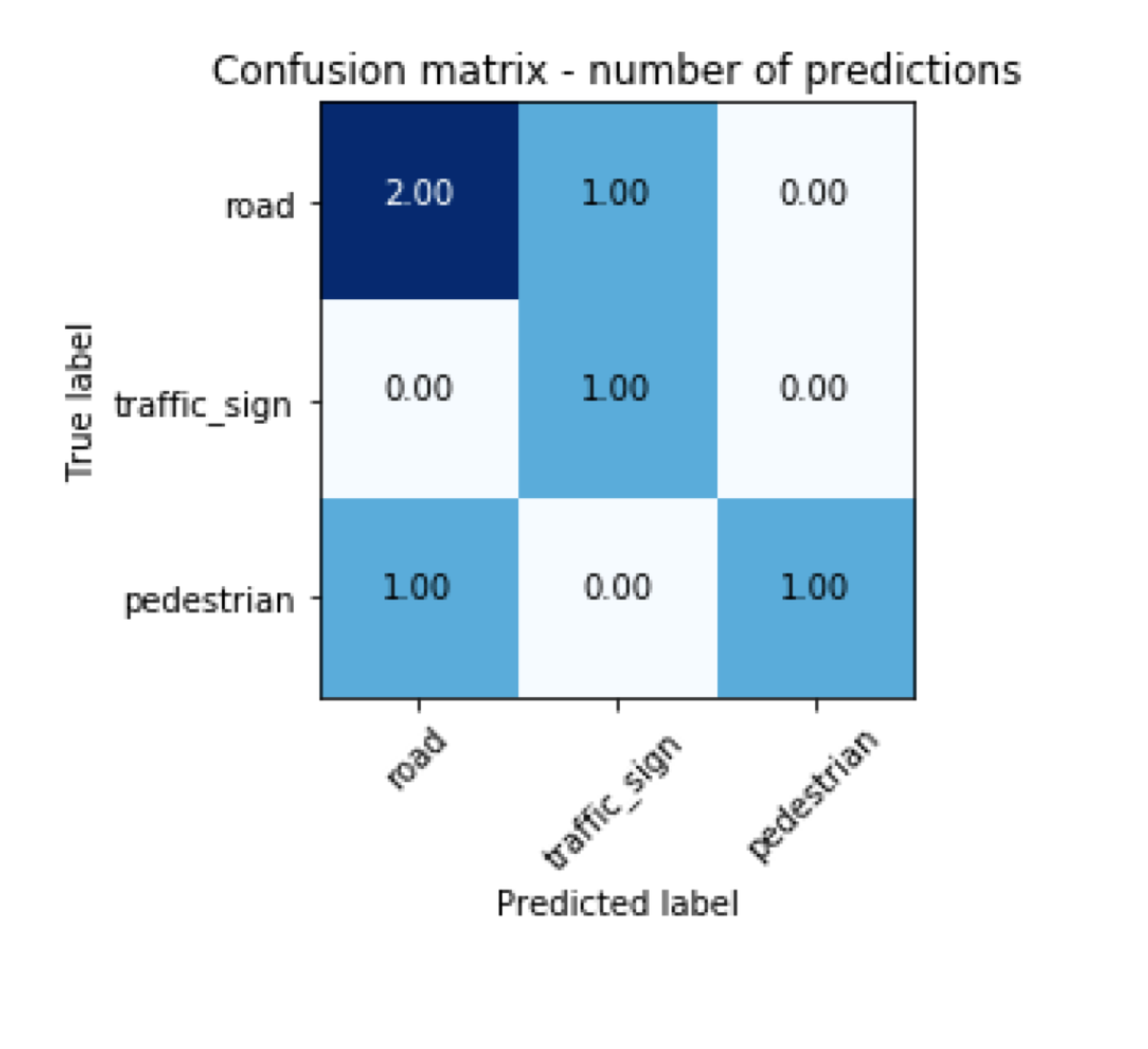
If we plot it nicely, it should be easier to understand its content.
import matplotlib.pyplot as plt
import numpy as np
import itertools

cm = confusion_matrix(y_true, y_pred, labels=labels)

cmap=plt.cm.Blues
plt.imshow(cm, interpolation='nearest', cmap=cmap)
plt.title('Confusion matrix - number of predictions')
tick_marks = np.arange(len(labels))
plt.xticks(tick_marks, labels, rotation=45)
plt.yticks(tick_marks, labels)

thresh = cm.max() / 2.
for i, j in itertools.product(range(cm.shape[0]), range(cm.shape[1])):
    plt.text(j, i, format(cm[i, j], '.2f'),
        horizontalalignment="center",
        color="white" if cm[i, j] > thresh else "black"
    )

plt.ylabel('True label')
plt.xlabel('Predicted label')
plt.tight_layout()

The first thing we notice is the fact that true labels are in rows. The columns contain predictions. The labels are in the same order as the order of parameters in the labels argument of the confusion matrix function.
If I want to read the result of predicting whether something is a road, I look at the first row (because the “true label” of the first row is “road”). Now, I see that twice the road was predicted to be a road. That is correct. Then once the road was interpreted as a traffic sign. That is an incorrect prediction. Never the road was predicted to be a pedestrian.
The second row is tricky because in its first column there is the number of traffic signs incorrectly predicted to be a road. The number of correctly predicted traffic signs is in the second column of the second row. Its last column contains traffic signs incorrectly labeled as pedestrians.
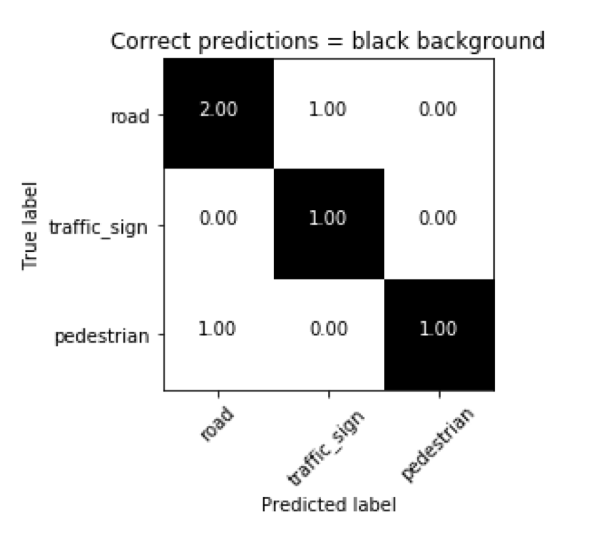
In short, the diagonal contains the correct predictions. In the next chart, everything with the black background is correctly predicted.
from matplotlib.colors import ListedColormap
cmap = ListedColormap(['white'])

cm = confusion_matrix(y_true, y_pred, labels=labels)

background = cmap(cm)
background[range(3), range(3), :3] = 0, 0, 0
plt.imshow(background, interpolation='nearest')
plt.title('Confusion matrix - correct predictions with black background')
tick_marks = np.arange(len(labels))
plt.xticks(tick_marks, labels, rotation=45)
plt.yticks(tick_marks, labels)

thresh = cm.max() / 2.
for i, j in itertools.product(range(cm.shape[0]), range(cm.shape[1])):
    plt.text(j, i, format(cm[i, j], '.2f'), horizontalalignment="center", color="white" if i == j else "black")

plt.ylabel('True label')
plt.xlabel('Predicted label')
plt.tight_layout()


