It is a simple method of checking what is wrong with a machine learning model, but I remember that when I was learning about regression methods, it took me a while to realize that I can use plots to understand the results produced by the model.
Typically, when we create some regression model, we care about the error metric that describes how well it fits the data. For example, we can use the root squared mean error.
import seaborn as sn
from sklearn.pipeline import Pipeline
from sklearn.preprocessing import MinMaxScaler
from sklearn.linear_model import LinearRegression
from sklearn.model_selection import train_test_split
from sklearn.metrics import mean_squared_error

data = sn.load_dataset('mpg')
data = data.dropna().drop(columns = ['origin', 'name', 'model_year'])
X = data.drop(columns = ['mpg'])
y = data['mpg']

X_train, X_test, y_train, y_test = train_test_split(X, y, test_size=0.2, random_state=31415)
pipeline = Pipeline(steps = [
    ('minmax', MinMaxScaler()),
    ('lin_reg', LinearRegression())
])
y_pred = pipeline.fit_predict(X_train, y_train)

#RMSE
from math import sqrt
sqrt(mean_squared_error(y_test, y_pred))

What does it tell us? Not much. It tells us only that the root squared mean error is approximately 4.33. It is very accurate and precise description of the error. Such a metric is helpful when we must compare two different models.
It is also completely useless when we must explain in what case our model is wrong. If the only thing we know is RMSE (or any other metric), there is no way of knowing whether the model makes a lot of small errors or a few huge mistakes.
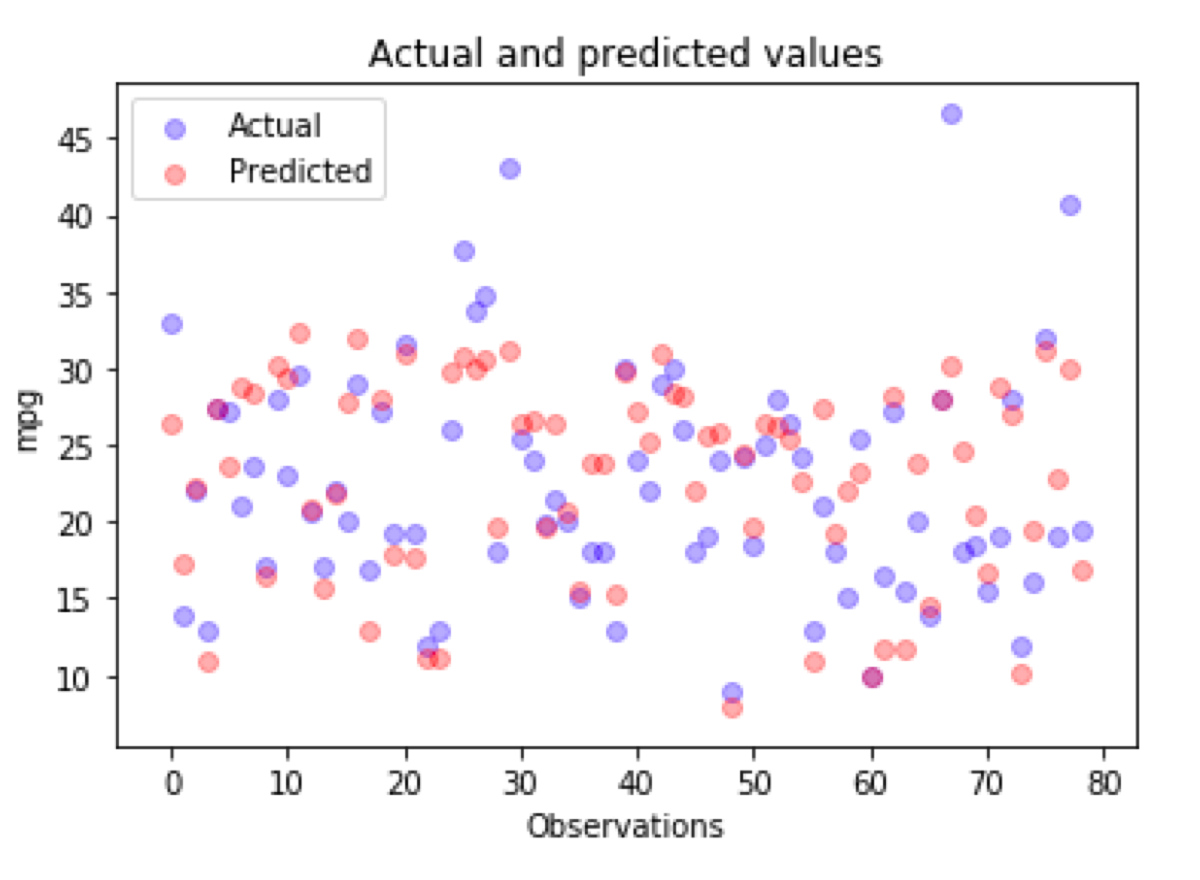
What can we do about it? An old cliche says that “A picture is worth a thousand words.” Hence, we can draw a scatter plot like this one:
import matplotlib.pyplot as plt
_, ax = plt.subplots()

ax.scatter(x = range(0, y_test.size), y=y_test, c = 'blue', label = 'Actual', alpha = 0.3)
ax.scatter(x = range(0, y_pred.size), y=y_pred, c = 'red', label = 'Predicted', alpha = 0.3)

plt.title('Actual and predicted values')
plt.xlabel('Observations')
plt.ylabel('mpg')
plt.legend()
plt.show()

Now, we see that we have a few outliers in my dataset and no way of predicting them correctly using a linear model. For sure, we can notice what errors the model makes and spot the difference between the actual and the predicted value. All of that requires some effort because this kind of plot is difficult to read.
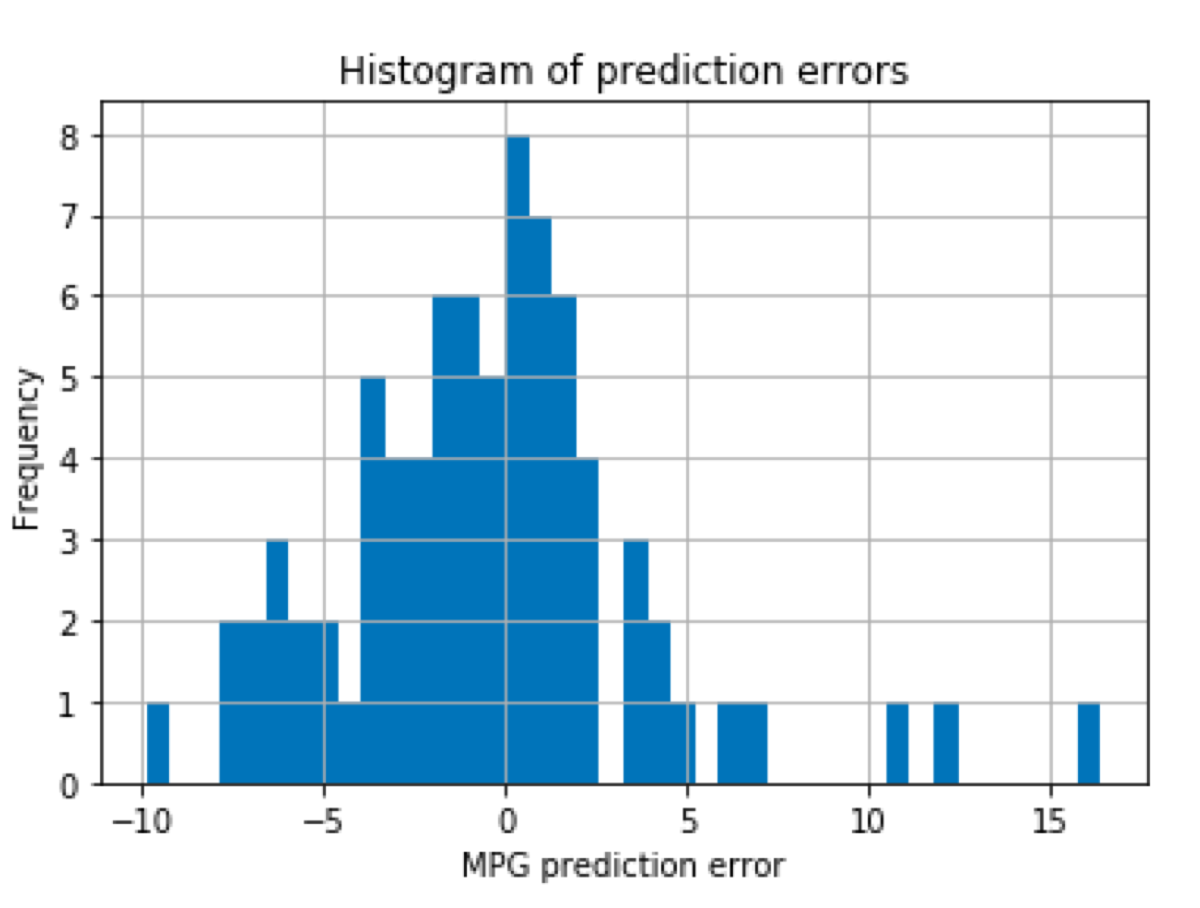
We can visualize the same information in a more user-friendly way by calculating the difference and plotting a histogram:
diff = y_test - y_pred
diff.hist(bins = 40)
plt.title('Histogram of prediction errors')
plt.xlabel('MPG prediction error')
plt.ylabel('Frequency')

Now we see what kind of errors the model makes and how frequently they occur.

