
That may be one of those tools which I will never use in real life, but I thought that it is interesting enough to learn it anyway.
Table of Contents
Andrews curves plot is a way of visualizing the structure of independent variables. The possible usage is a lightweight method of checking whether we have enough features to train a classifier or whether we should keep doing feature engineering and cleaning data because there is a mess in data.
We may do it because the independent variables get summarized and the data dimensions get reduced to only two. To be more precise, every observation gets reduced to a curve which can be projected in two-dimensions. When we draw the plot and use colors to distinguish the labels, we see whether all observations are tangled with each other or whether the observations are grouped in separate streams.
In Scikit-learn all we need is one function and preprocessed data (values must be normalized to (0.0, 1.0).
from sklearn.preprocessing import MinMaxScaler

scaler = MinMaxScaler()
scaler.fit(X)

X = pd.DataFrame(scaler.transform(X), columns = ['feature_1', 'feature_2', 'label'])

from pandas.plotting import andrews_curves

andrews_curves(X, 'label', colormap = 'winter')
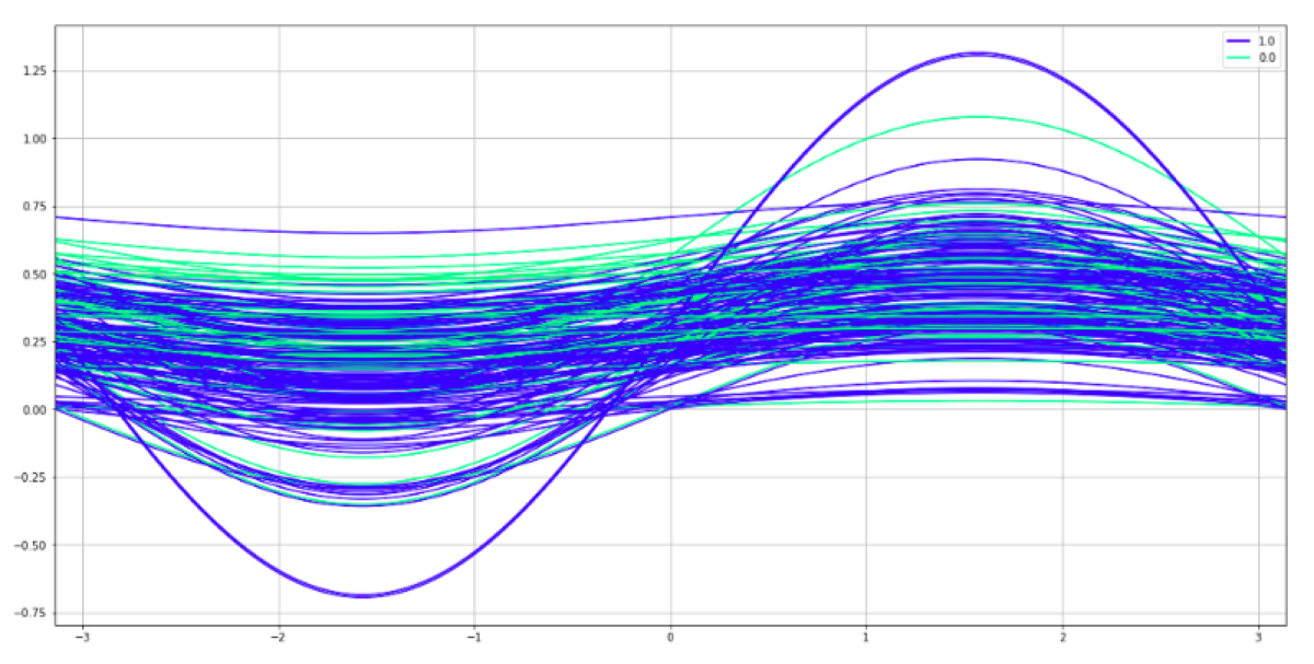
How to interpret the chart
What do we see here? Both colors are mixed. There is no way to distinguish between them. The same problem exists in the feature dataset. There is no way to predict the target class using those two features.