
When I looked at a plot generated by Prophet for the first time, I was lost. I started looking for the explanation in the documentation. There were none. Great, so what now? I googled it. Now I was sure that I was the only person who did not understand the plot because I could not find anything (not even a StackOverflow question or someone asking for an explanation).
Table of Contents
I had two options. I could either give up or start digging in the source code. Fortunately, when you look at the source code of the Prophet plot function, everything starts to be obvious and easy.
Example
Let’s begin at the beginning ;) In the documentation, they use a time series of the log daily page views for the Wikipedia page for Peyton Manning as the input dataset.
In the first step, I am going to download the dataset and plot a line plot of the dataset.
import fbprophet
import matplotlib.pyplot as plt
import pandas as pd

!curl -O https://raw.githubusercontent.com/facebook/prophet/master/examples/example_wp_log_peyton_manning.csv
data = pd.read_csv("example_wp_log_peyton_manning.csv")
data["ds"] = pd.to_datetime(data["ds"])

fig = plt.figure(facecolor='w', figsize=(10, 6))
plt.plot(data.ds, data.y)
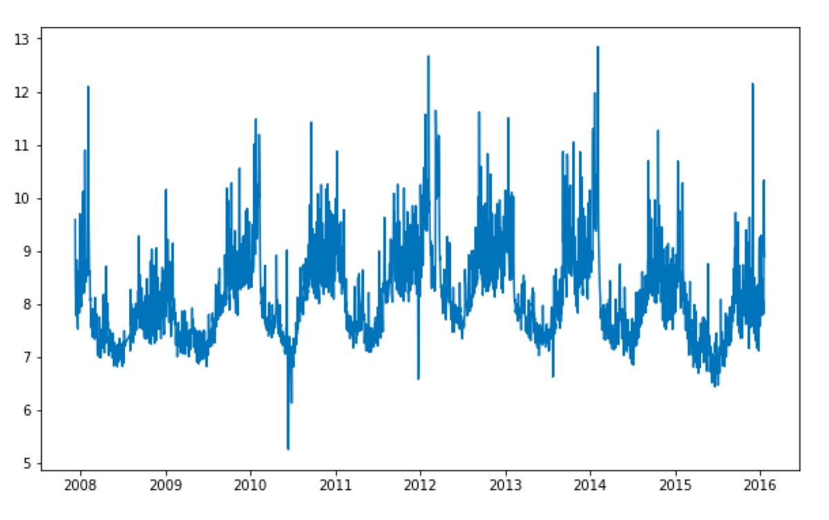
In the picture, I cannot spot the individual data points. All I have is a weird broad blue line. It is not an error! It looks like this because there are many data points and they get plotted close to each other. That observation is going to be important later ;)
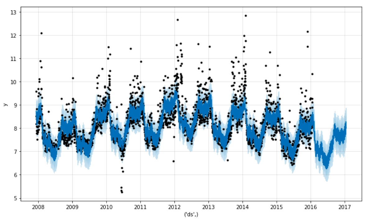
In the second step, I am going to fit a Prophet model to the data and generate the prediction. When the prediction is ready, I will plot it using the Prophet’s plot function:
model = fbprophet.Prophet()
model.fit(data)

future = model.make_future_dataframe(periods=365)
forecast = model.predict(future)

plot = model.plot(forecast)
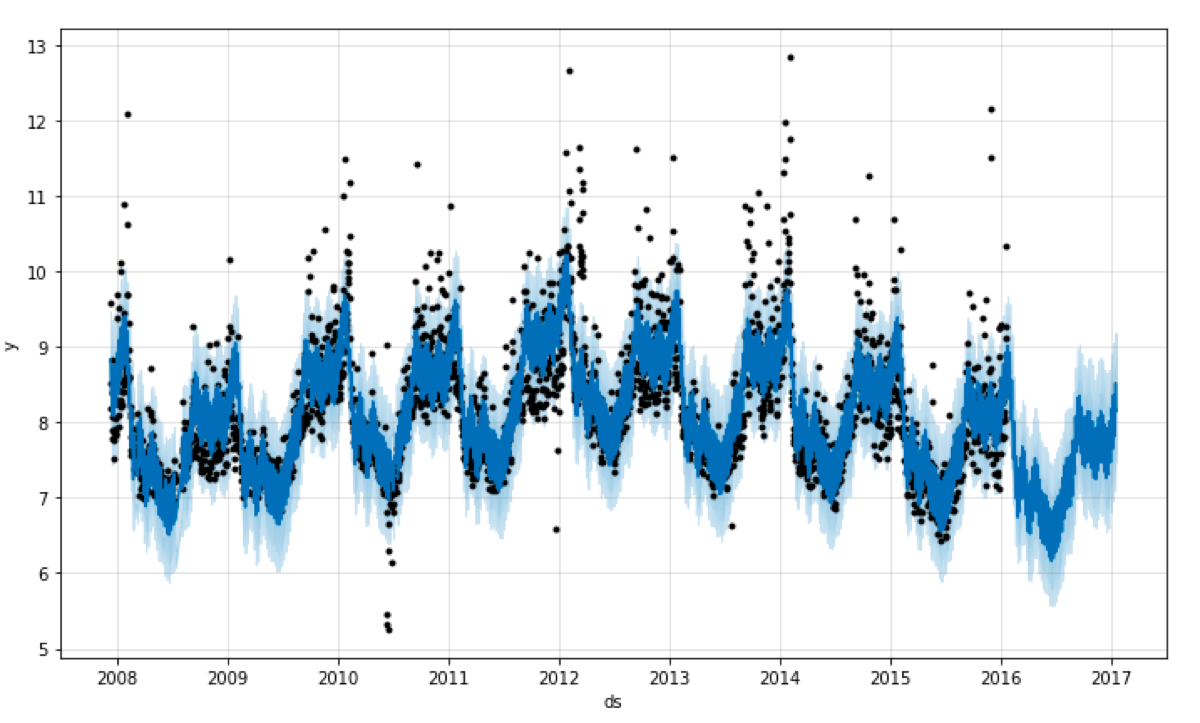
When I looked at that for the first time, I could not understand anything. What is the dark blue area? Is it the uncertainty interval? What is the light blue area? Why do I see the black dots on the plot?
Explanation
Now it is time to look at the source code and run the function. Here is the source code of the plot function:
def plot(
    m, fcst, ax=None, uncertainty=True, plot_cap=True, xlabel='ds', ylabel='y',
    figsize=(10, 6)
):
    if ax is None:
        fig = plt.figure(facecolor='w', figsize=figsize)
        ax = fig.add_subplot(111)
    else:
        fig = ax.get_figure()
    fcst_t = fcst['ds'].dt.to_pydatetime()
    ax.plot(m.history['ds'].dt.to_pydatetime(), m.history['y'], 'k.')
    ax.plot(fcst_t, fcst['yhat'], ls='-', c='#0072B2')
    if 'cap' in fcst and plot_cap:
        ax.plot(fcst_t, fcst['cap'], ls='--', c='k')
    if m.logistic_floor and 'floor' in fcst and plot_cap:
        ax.plot(fcst_t, fcst['floor'], ls='--', c='k')
    if uncertainty:
        ax.fill_between(fcst_t, fcst['yhat_lower'], fcst['yhat_upper'],
                        color='#0072B2', alpha=0.2)
    ax.grid(True, which='major', c='gray', ls='-', lw=1, alpha=0.2)
    ax.set_xlabel(xlabel)
    ax.set_ylabel(ylabel)
    fig.tight_layout()
    return fig
Let’s run it step by step. I have not specified the ‘ax’ parameter, so the function is going to create a new plot:
figsize=(10, 6), xlabel='ds', ylabel='y'
fig = plt.figure(facecolor='w', figsize=figsize)

ax = fig.add_subplot(111)
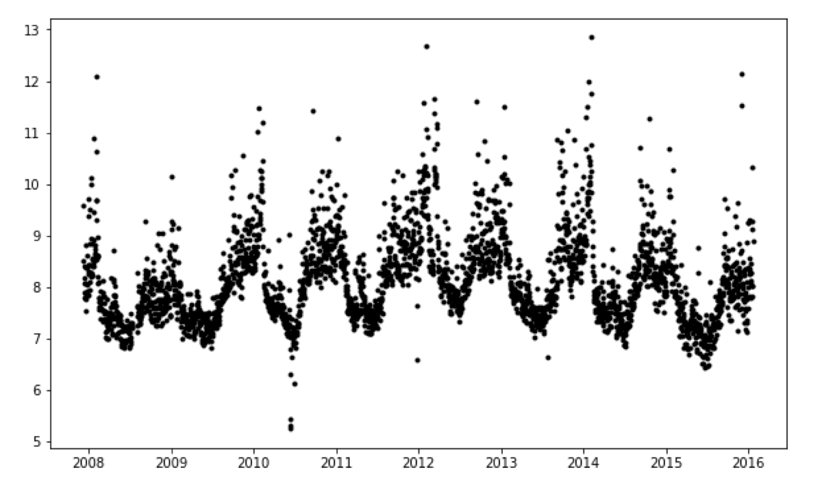
In the next step, it is going to plot the black dots which indicate the data points used to train the model.
fcst_t = fcst['ds'].dt.to_pydatetime()
ax.plot(model.history['ds'].dt.to_pydatetime(), model.history['y'], 'k.')
The next line plots the prediction.
ax.plot(fcst_t, fcst['yhat'], ls='-', c='#0072B2')
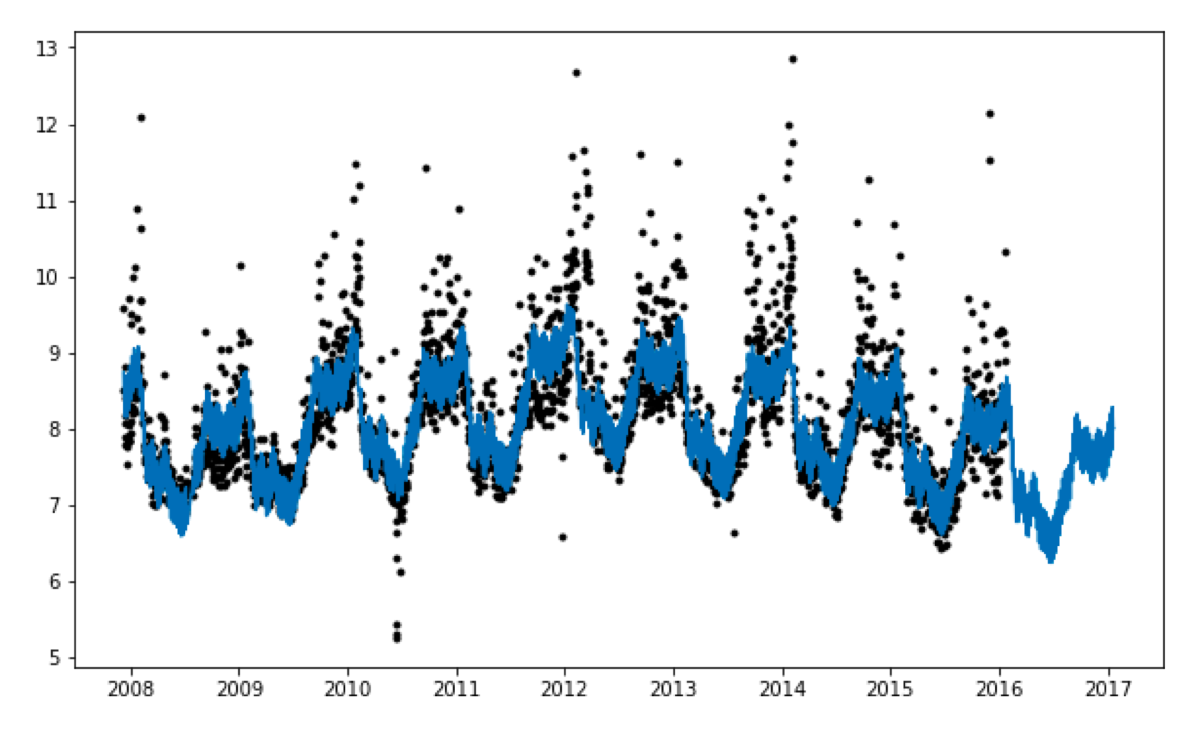
Once again, it was supposed to be a line plot, but it looks like a weird wide blue area.
At the beginning of this blog post, I have displayed a plot of the input data. When I scroll back and compare those two plots, it is apparent that the forecast plot looks like this because there are so many data points.
It does plot a line plot, but it cannot fit it in the plot area. Therefore it looks like this!
What happens after that? I have not specified the ‘cap’ and the ‘floor,’ so in the next step, the function is going to plot the uncertainty intervals.
ax.fill_between(fcst_t, fcst['yhat_lower'], fcst['yhat_upper'], color='#0072B2', alpha=0.2)
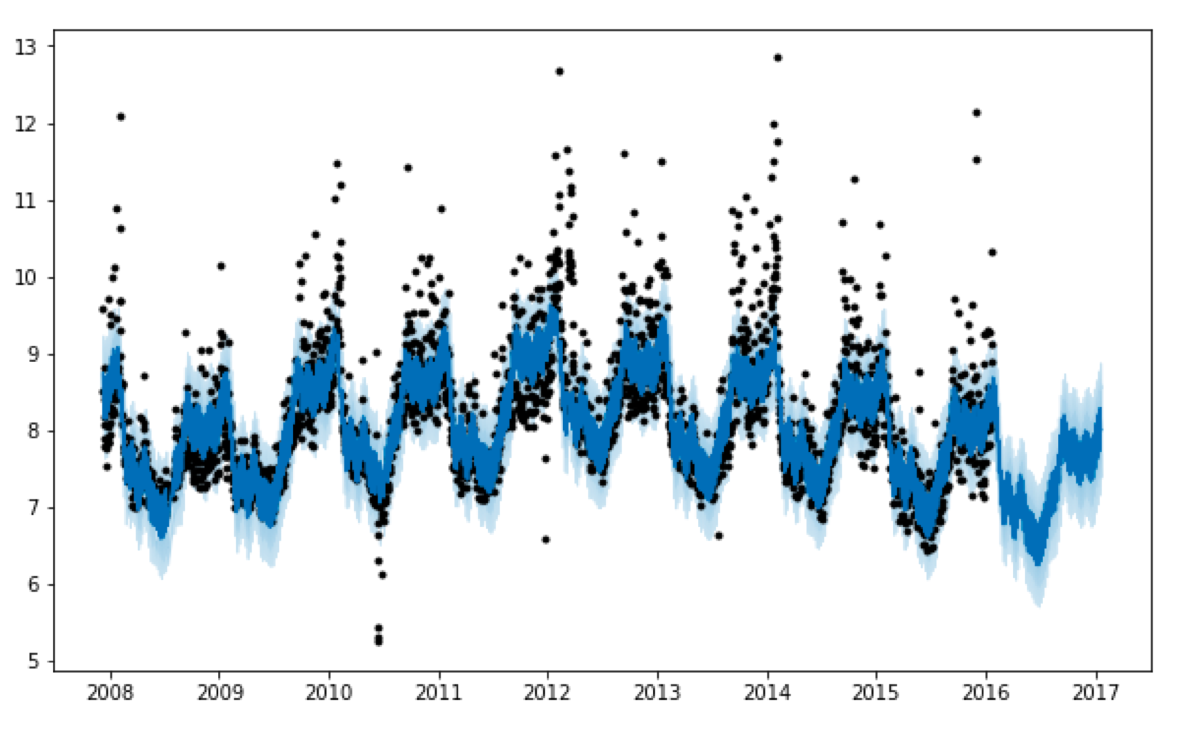
Finally, it draws the grid and the label axis:
ax.grid(True, which='major', c='gray', ls='-', lw=1, alpha=0.2)
ax.set_xlabel(xlabel)
ax.set_ylabel(ylabel)
fig.tight_layout()
Like most of the plots, the Prophet prediction plot gets easier to read when you look at its parts separately ;)