Yet another story from the “What’s cooking?” Kaggle competition. I was looking at other people’s Kaggle kernels and found a very interesting one.
Table of Contents
The author noticed that one of the distinctive characteristics of cuisine are pairs of ingredients (for example salt + pepper, olive oil + vinegar, eggs + bacon, etc.) In the original kernel, the author used NLTK to convert the ingredients to bigrams. This solution has one huge problem. When you have an ingredient like “olive oil” it becomes a tuple (“olive”, “oil”). Two words, one ingredient. Not what I wanted.
From a list of ingredients to bigrams
Our starting point is a dataset which looks like this:
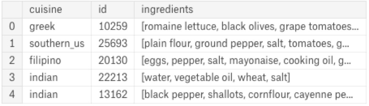
Every row consists of an identifier, the name of the cuisine and a list of ingredients. I want a list of pairs. If the ingredient list has three elements: “eggs, salt, pepper” I want three pairs: (“eggs”, “salt”), (“eggs”, “pepper”), and (“salt”, “pepper”).
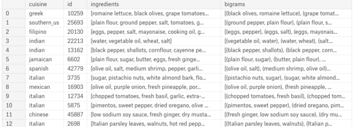
from itertools import combinations
dataset['bigrams'] = dataset.ingredients.apply(lambda x: [tuple(sorted(pair)) for pair in combinations(x,2)])
Visualise common pairs of ingredients In the next step, I want to find the most popular pairs of ingredients. Then I want to create a graph with edges between cuisine and its ingredients.
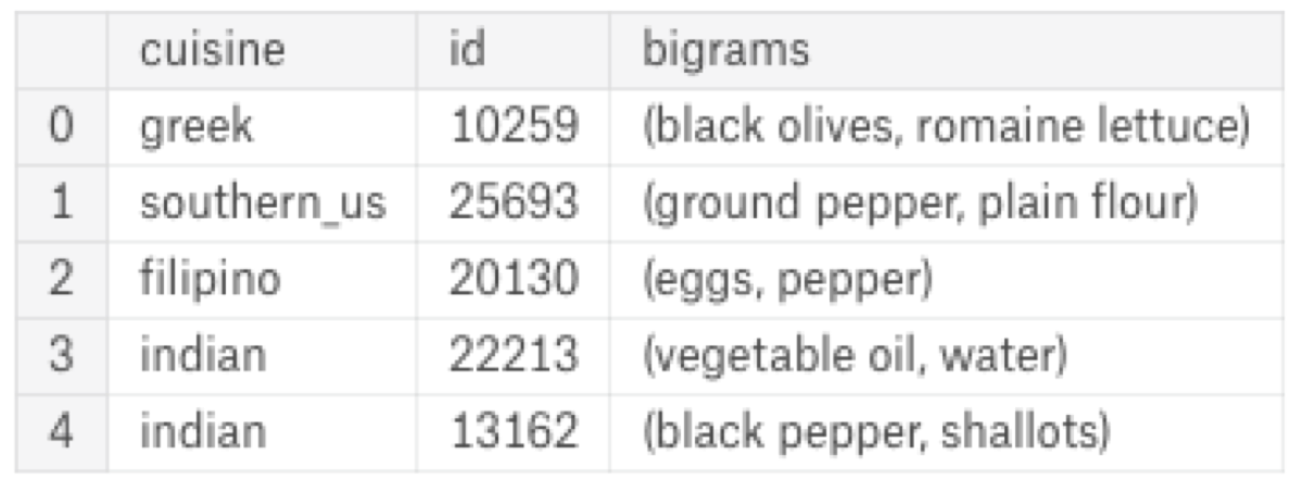
Firstly, I have to convert the list of bigrams to data frame rows:
ingredient_to_pairs = train.bigrams.apply(pd.Series) \
    .merge(train, right_index = True, left_index = True) \
    .drop(["ingredients", "bigrams"], axis = 1) \
    .melt(id_vars = ['cuisine', 'id'], value_name = "bigrams") \
    .drop("variable", axis = 1) \
    .dropna()
Now I have to count the pairs, sort them by the number of elements, and select the most popular ones.
mexican = ingredient_to_pairs[ingredient_to_pairs["cuisine"] == "mexican"] \
    .drop(columns = "cuisine") \
    .groupby(["bigrams"]).count().sort_values("id", ascending = False)[:25]
mexican['cuisine'] = 'mexican'
italian = ingredient_to_pairs[ingredient_to_pairs["cuisine"] == "italian"] \
    .drop(columns = "cuisine") \
    .groupby(["bigrams"]).count().sort_values("id", ascending = False)[:25]
italian['cuisine'] = 'italian'
combined = pd.concat([mexican, italian])
combined = combined.reset_index()
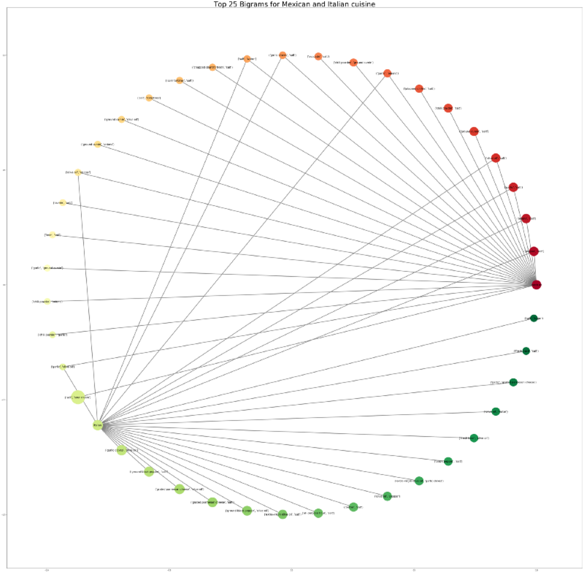
Finally, I can generate the graph using NetworkX. I use the circular layout because it makes it trivial to spot the ingredients popular in both cuisines.
import networkx as nx
g = nx.from_pandas_edgelist(combined, source = 'cuisine', target = 'bigrams')
pos = nx.circular_layout(g)
cmap = plt.cm.RdYlGn
colors = [n for n in range(len(g.nodes()))]
nx.draw_networkx(g, pos, node_size = combined['id'].values * 4, edge_color = 'grey', cmap = cmap, node_color = colors, font_size = 15, width = 3)
plt.title("Top 25 Bigrams for Mexican and Italian cuisine", fontsize = 40)
plt.gcf().set_size_inches(60, 60)
plt.show()